Infographic

In order to illustrate the differences between boroughs in a concise way we decided to summaries the most obese borough and the least obese borough in the form of an infographic made using Piktochart. The most obese borough was Barking and Dagenham. The Least obese borough was The City of London. However, because many data for the different factors we are investigating were missing/unobtainable for this borough and moreover, it is not a very representative borough because of its very small population and land use, we decided to take Kensington and Chelsea which was the joint second least obese borough (with Richmond upon Thames).

new-piktochart_903_064bfd60e8c35ee1cdbedcc979fb82b5260849ca

Diet

All visualisations on this page were made using data collected by PointX on Public Health England website which can be found here.

https://sadiakd.carto.com/builder/98a9494c-cd18-11e6-866c-0e3ff518bd15/embed

Note if legend does not appear on the map, please enlarge screen.

Figure 3.1 – London choropleth map illustrating number of fast food outlets per 1000 people per borough

Choropleth map analysis
The map shows the density of Fast Food and Takeaway Outlets, Fast Food Delivery Services, Fish and chip shops. It can be seen that the darkest areas are located near the center, where it is likely to have more demand for fast food outlets. If compared to the obesity map, however, it can be seen that higher obesity prevalence areas which are expected to have more outlets are actually light in color. The color scale may be a little misleading, as City of London stands out from the rest with a count of 38.4 per 1000 people. Camden and Westminster, though colored in the same color, are still 1.44 and 2.05, respectively.

In addition, this data is calculated based on the population, which signifies that the figures used as ‘population’ are residents rather than commuters to the area where the outlets are. Considering City of London, for example, whose value had to be replaced to the next highest value because it was too large, demonstrates that these outlets concentrate in areas where there are many people during the day rather than during the night. Hence, calculating the number of fast food outlets in proportion to the population may not sufficiently reveal the relationship with the actual residents of a particular area.

obesityfastfood

Figure 3.2 – Scatter Plot illustrating the correlation between percentage of obesity and number of fast food outlets.

Spearman’s Rank Correlation Coefficient (SRCC): -0.0954 (3 s.f.)

Scatter plot analysis
Spearman’s rank correlation coefficient is -0.0954 which means that there is a very weak correlation. By looking at the values on the graph, it is also quite apparent that numbers are all within the same range. The values range from 0.24 to 1.99. Clearly the visualisation does not show any effect of fast food on obesity. However, from this data and visualisation it we should not conclude that there is no correlation, for there are various limitations of the data and visualisation.

Limitations of Fast Food Outlet Data
Unfortunately it was hard to identify the year the count of fast outlets was collected. The publishing date was 2006 which is fairly old, considering the growth of certain businesses and emergence of new ones over the past decade. Hence there is a possibility that the fast food outlet count from before 2006 is not large enough to correspond to the obesity rates, which are taken from 2013-2015.

Another limitation of the data and perhaps the most important is the categorisation of fast food. According to Public Health England who published the data, ‘“fast food” refers to food that is available quickly, therefore it covers a range of outlets that include, but are not limited to, burger bars, kebab and chip shops and sandwich shops.’ This indeed is actually quite a diverse range of food, with very different ingredients, nutritional values, and portion sizes. Question arises to whether the sole criterion of ‘time’ spent on cooking and eating is sufficient to decide the healthiness of food.

Other candidates for fast food are food provided in restaurants, takeaways and home delivery. Ready-made sandwiches at coffee shops can be termed fast food as well, though not sold in a shop under the category of ‘fast food’. Public Health England mentions this issue, stating that ‘restaurant or café which would mean they are not considered here despite selling similar types of food to those included in this analysis.’ Similarly, it mentions that bakeries can be a type of fast food provider as well, though they are not included in the analysis. If these were counted, both the distribution of different types of these ‘fast food’ outlets will be revealed and perhaps a more comprehensive picture of the relationship between outlets and health of local residents.

Influence of Fast Food on Obesity
‘People generally have easy access to cheap, highly palatable and energy-dense food frequently lacking in nutritional value, such as fast food.’ (National Obesity Observatory)

There was a controversial film called ‘Super Size Me’ in 2004. In the documentary, the director does an experiment on himself to see what would happen if he only ate food from McDonalds for 30 days. The result is that he gains excessive weight and concludes that McDonalds is unhealthy. However, there are some people who dispute this result by saying that his portion sizes were abnormal, and that it is not the content itself but rather the amount of calories he was taking in, not only from the food but also from the shakes. (McDonalds UK) While it can be said that this authentic type of fast food is high in calories and low in nutritional value, that is a characteristic of a particular type of food rather than the way it is processed.


References

Gov.uk. (2016). Density of Fast Food Outlets in England. [online] Available at: https://www.gov.uk/government/uploads/system/uploads/attachment_data/file/578044/Fast_food_metadata_and_summary_local_authority_data.xlsx [Accessed 18 Jan. 2017].

McDonald’s Press Releases Section – Press Release August, 2004 Page. [online] Available at: https://web.archive.org/web/20071012135323/http://mcdonalds.co.uk/pages/global/supersize.html [Accessed 18 Jan. 2017].

noo.org.uk. (2017). Obesity and the Environment. [online] Available at: https://www.noo.org.uk/uploads/doc/vid_15683_FastFoodOutletMap2.pdf [Accessed 18 Jan. 2017].

Exercise

Open Green Spaces

The following visualisations were made using data collected from the London Datastore and can be found here.

Definitions
It is important to understand what constitutes as ‘open access’ as this allows us to clearly understand the data and could furthermore aid the analysis;
Meaning of Open Access Data: Public open space is designated according to ‘Access’ attribute information contained within GIGL open spaces dataset i.e. values such as ‘open, free’ are accepted as allowing access to public. Homes further away than the maximum recommended distance are considered to be deficient in access to that type of public open space.
In 2015 the recommended distances for each type were:
R – Regional Parks = 5km max
M – Metropolitan Parks = 2.4km max
D – District = 1.2km max
LSP – Local, Small and Pocket parks = 400 metres max

https://uclqcde.carto.com/builder/c05eb6bc-cbc8-11e6-a73f-0e05a8b3e3d7/embed

Note if legend does not appear on the map, please enlarge screen.

Figure 4.1 – London choropleth map illustrating percentage of population with access to green spaces in 2013 per Borough.

Choropleth map analysis
In this map the darker areas depict the boroughs with greater percentage of access to green spaces, while the lighter areas consequently depict those with lower access to green spaces.  On average, 41.2 of the population has access to open spaces (according to the data illustrated in figure 4.1), however the data varies greatly between boroughs, with boroughs such as Hackney illustrating a high percentage of access to open spaces (67.8%), and boroughs such as Hillingdon depicting low access to open spaces (29.4%). Hackney (67.7%), Tower Hamlets (58.5%) and Haringey (57%),  seem to have the greatest population with access to open space, results that are slightly surprising given the lack of major green spaces (compared to for example Richmond Upon Thames) in its proximities. After looking in greater depth it becomes evident that these do have a wide range of smaller public parks available to the public that are located across the borough, which would enhance the overall chance of having access to one. Similarly, they contain a variety of other ‘open spaces,’ (specified below), explaining why its numbers are notably higher.

Boroughs such as Hillingdon show low access to open spaces, which is initially surprising given the major amounts of green space (due to Colne Valley Regional Park) evident within its premises. These green spaces, however, are not entirely freely accessibly to the public (since many are reservoirs and parks, often requiring payment for entrance, or undergoing closure at sundown)  and given the data only includes free, easily accessible spaces, it explains why they are not included in the data. Furthermore, parts of the evidently open spaces are located around Heathrow, which would furthermore not be accessible to the public, and thus are disregarded in the data for open spaces.

Comparing the obesity map with figure 4.1, we can deduce a correlation between access to open and green spaces and percentage of obesity per borough. For a relationship between obesity and open spaces to occur we would expect the darkest area (Blue) in the obesity map (hence highest percentage of obesity) to correlate with the lightest area (faint green) of the open spaces map (hence lowest access to open spaces). Most of the darker boroughs in figure 4.1 are indeed much lighter on the scale of the obesity map. It is evident from the map that the higher prevalence of obesity boroughs including (but not limited to) Hillingdon (21.9%), Croydon (22.7%), and Havering (24.8%) show a lower percentage of access to open and green spaces ranging between a meagre 27 to 30%.

obesitygreenspaces

Figure 4.2 – Scatter plot illustrating the correlation between the percentage of population obese and the percentage of population with access to open space per Borough.

Spearman’s Rank Correlation Coefficient: -0.393 (3 s.f.)

Scatter plot analysis
From the scatter plot above, the correlation coefficient for this factor is weak to moderate (-0.393). The line graph suggests a faint negative correlation (looking at the line of best fit); the greater the percentage of households with access to open space, the lower the prevalence of obesity. Indeed, many studies in the past have suggested a link between between better health outcomes (including lower prevalence of obesity) and greater access to green space, given the apparent increase in levels of physical activity by individuals living in ‘greener’ areas. According to a study by Mytton et al. a positive association between green space and overall physical activity is evident. The “odds of achieving recommended physical activity”  when having greater access to green space were significantly higher in urban areas (Mytton, 2013). Open spaces are usually well equipped with “recreational amenities” such as cycling and walking, and hence the correlation with physical exercise is no surprise (Ghimire, 2015). Open spaces therefore indirectly correlate to a reduction in obesity, given the increased incentive to do exercise. Notably, these positive correlations are often weak, similar to the correlation data demonstrated in figure 4.2. Hence, amounts of uncertainty remain regarding the overall correlation, and further research needs to be done.

Limitations of Data
This measure takes no account of the quality or facilities at each open space. Hence, while a particular space might be accessible to the public, it does not mean they are perfect when it comes to exercising or moving around significantly. For example, some open spaces are of historic value, such as churchyards, which are evidently not ideal for exercising. Hence ‘open data,’ while it includes green parks ideal for exercising and movement, does not necessarily signify spaces perfect for exercise.


Sports Facilities

The following visualisations were made using data collected from the London Datastore and can be found here.

https://uclqcde.carto.com/builder/0e768b80-c39b-11e6-b254-0e3a376473ab/embed

Note if legend does not appear on the map, please enlarge screen.

Figure 3.3 – London choropleth map illustrating number of sports and leisure facilities per 1000 people per Borough.

Choropleth map analysis
The Sports Facilities map displays the number of sports and leisure facilities per 1000 people per Borough, and was created in order to find links between high obesity areas and the population’s access to exercise facilities. We had initially assumed that areas with more facilities available to the public would correspond with areas with the least prevalence of obesity, as we also assumed that people tend to use the facilities in proximity to their homes.

The map shows that the average number of sports facilities per 1000 people is 2.37. However, when looking at the map it is important to note that it may seem slightly misleading, as the highest number of facilities is 15.7 per 1000 people, meaning that for the darkest colours, the numbers vary hugely. For instance, Both Kingston upon Thames and City of London appear in the darkest shade, but Kingston upon Thames only has 2.4 facilities per 1000 people, whereas City of London has 15.7.

When looking for trends between this map and the Obesity one (link), there is no significant pattern to be seen. In fact, areas where we assumed there would be more facilities due to their lower obesity rates, (Richmond upon Thames, Wandsworth, Lambeth, Tower Hamlets, Camden, Kensington and Chelsea) tend to also be areas with very few facilities, with the exception of Richmond upon Thames.

obesityfacilities
Figure 3.4 – Scatter Plot illustrating the correlation between percentage of obesity and number of sports facilities per 1000 people of the population.

Spearman’s Rank Correlation Coefficient: -0.0246 (3 s.f.)

Scatter plot analysis
A Spearman’s Rank Correlation Coefficient was calculated and shows an incredibly weak correlation of -0.0246 (3 s.f.). This shows that there is no real trend to be found between areas in which facilities exist and areas with the most prevalence of obesity. Accordingly, the scatter plot comparing these two factors also shows that there is no clear pattern, with the majority of boroughs containing between 1-3 facilities per 1000 people. City of London and Ealing are exceptions to this, with 15.7 and 13.9 facilities per 1000 people respectively. Apart from this huge increase, the number of facilities per borough would have stayed very similar (around 2 per 1000 people), which could point to other factors, not a lack of facilities, leading to less sports participation and increased obesity rates.

The reasons behind a lack of correlation between obesity and the prevalence of sports facilities could be a variety of things. First, people may use gym or sports facilities closer to their areas of work, rather than in the boroughs they reside in. Also, sports and leisure facilities can take up a significant amount of space, depending on what type of activities they were created for. Therefore, the creation of sports facilities may be linked more strongly to availability of space, or cost of construction, than to actual demand. Also, the data did not reveal whether or not the facilities were open to the public and free or if they included fees. This would therefore have a link with income, and further limit people’s ability to use such facilities.

Since there was no clear correlation between facilities and obesity, it is hard to come to any conclusions on how the government could better fund these areas. Therefore, we chose to create a Sports participation map (see below), to show which boroughs were the most active in London, and with the hopes of better identifying areas which need further encouragement and help from the government to partake in physical activity.

Limitations of Sports Facilities Data
There was a lack of distinction between sports facilities run by the government, that consequently received government budgets, and privately run businesses.
Moreover, the data does not distinguish between facilities that belong to schools or colleges, which are unlikely to be open to the public. Thus, while these are counted in the data set, they are not actually available to the whole population, and not of value in this context.

Furthermore, it was difficult to distinguish which school and colleges had a range of facilities and which had little, thus it does not represent the quality of the various facilities.

Finally, the data does not mention costs of facilities and memberships per facility, which would have provided us with interesting information regarding the affordability of facilities across London, and in turn offer insight on the accessibility of facilities in economic terms.


Sports Participation

The following visualisations were made using data collected from the London Datastore and can be found here.

https://uclqcde.carto.com/builder/6907c78a-cd0a-11e6-9a93-0ecd1babdde5/embed

Note if legend does not appear on the map, please enlarge screen.

Figure 3.5 – London choropleth map illustrating percentage of population participating in sports 3 times a week.

Choropleth map analysis
The Sport Participation choropleth map displays the percent of a population per borough that participate in physical activity three times a week in 2014 and 2015. This map was created in order to show a clearer link between the lifestyle choice of partaking in physical activity and its relationship to obesity, as well as to compliment theories surrounding factors such as income and education levels. It was also created due to the issues arising from the “Sports facilities” map, which we found to not represent physical activity trends of the people living in boroughs.

According to the NHS’ official recommendations on the treatment of obesity, “maintaining a healthy weight requires physical activity to burn energy”(National Health Service). Therefore, when creating this map we were hoping to find that the areas with the highest prevalence of obesity would be the ones with the least recorded percentage of sports participation. 

For the most part, our prediction is correct. Areas with the percentage of most participation are darkest in shade and range from 28.2% to 24%(Richmond upon Thames, Wandsworth, Merton, Kensington and Chelsea, Hammersmith and Fulham), followed by slightly lower percentages from 22.8% to 20.8% (Haringey, Islington, Camden, Westminster, Lambeth and Bromley). Areas with the least prevalence in obesity are shown in the lighter colours, and there is a significant overlap in areas such as Wandsworth, Richmond upon Thames, Lambeth, Kensington and Chelsea, Camden, Haringey, Islington, Hammersmith and Fulham and Westminster. 

When comparing this map to that of Income per borough, one can see that areas with less income tend to also participate in less physical activity. This is not surprising, as a study has found that income and physical activity are linked; with “each additional ten thousand dollars in income increases the probability that an individual participates in some physical activity by 1 percent” (Humphreys and Ruseski, 2006). This could be linked to the cost of partaking in physical activity- nowadays many people use various facilities, such as gyms, swimming pools, personal fitness machines. All of these, as well as exercise equipment and clothes, cost money, and therefore people with higher incomes are probably more willing to spend money, and thus spend more time participating in physical activity (Humphreys and Ruseski, 2006). 

Similarly, when compared to the educational map, one can see that areas with higher percentages of degree attainment also participate in more sports. This could reflect how sports education in schools are important and effective in determining people’s lifestyle choices after their education years, and how further funding into lifestyle and sports education at schools could increase the chances of better choices for more people. In addition, higher degree attainment has a link with income as well. 

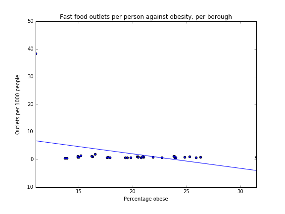
When comparing the map to the percentage of Fast Food outlets map, there is no clear pattern to be seen, although one would have originally assumed that people who do more sport would also have better eating habits. However, the fast food map does not reflect the eating habits of the population, and instead reflect the demand for well-known outlets in popular places, the city center or in places of work.

obesitysports

Figure 3.6 – Scatter Plot illustrating the correlation between percentage of obesity and percentage of sports participation.

Spearman’s Rank Correlation Coefficient (SRCC): -0.794 (3 s.f.)

Scatter plot analysis
This information above is further supported by  a strong negative correlation (-0.79) on the Spearman’s Rank Correlation Coefficient, which shows that areas whose population have the highest rates of participating in physical activity 3 times a week also show the lowest rates of obesity, and therefore suggests a strong link between the two factors. Additionally, we created a scatterplot showing ‘Sports participation against obesity, per borough’. This is another visual representation which shows a strong correlation between the two. Although these results are highly correlated, there are, of course, many factors other than physical activity levels that contribute to obesity. However, given that the average percent of the population to participate in physical activity 3 times a week is only 18.7%, there is definitely room for the government to further encourage sports participation in the general public.

Limitations of Sports Participation Data
The limitation with this data is that it only shows the percentage of people who participate in physical activity three times a week. It does not include data for people who participate in physical activity more or less than that, which could have given a clearer view on which boroughs participate in the most physical activity in general. Additionally, while it specifies “three times a week”, it does not specify the time of each session nor the intensity, which could also affect the overall results in showing the most active boroughs.

Also, the dataset does not specify how the data was checked, and therefore the results are what the population has self-reported. In accordance, this could mean that certain people may be untruthful about their levels of physical activity, which would make the results less reliable.

Lastly, there was no data available for City of London borough, which will have slightly affected the Spearman’s Rank Correlation Coefficient and could have shown either a stronger or weaker result.


References

Ghimire, R., Green, G., Ferreira, S., Poudyal, N. and Cordell, H. (2015). Green Space and Adult Obesity Prevalence in the United States. [online] Available at: http://ageconsearch.umn.edu/bitstream/196812/2/green%20space%20obesity.pdf.

Humphreys, B. and Ruseski, J. (2006). Economic Determinants of Participation in Physical Activity and Sport. 1st ed. International Association of Sports Economists, pp.2-19.

Mytton, O., Townsend, N., Rutter, H. and Foster, C. (2012). Green space and physical activity: An observational study using Health Survey for England data. Health & Place, [online] 18(5), pp.1034-1041. Available at: https://www.ncbi.nlm.nih.gov/pmc/articles/PMC3444752/.

National Health Service. (2016). Obesity – Treatment – NHS Choices. [online] Available at: http://www.nhs.uk/Conditions/Obesity/Pages/Treatment.aspx [Accessed 16 Jan. 2017].

Education

All visualisations on this page were made using data collected from the London Datastore and can be found here.

GCSE Attainment

https://sadiakd.carto.com/builder/48b24994-cd1c-11e6-9446-0ee66e2c9693/embed

Note if legend does not appear on the map, please enlarge screen.

Figure 2.1 – London choropleth map illustrating GSCE attainment  (percentage of population achieving at least 5 A*-C at GCSE) per Borough 2013/14.

Choropleth map analysis
Figure 2.1 shows that the average percent of the population who attained at least five A* GCSEs is 62.8%. Generally West London appears to have higher GCSE attainment and East London lower. However the pattern here is not so clear. We can identity a darker area in the South West, which shows much higher percentage of GCSE attainment than average in boroughs including Kingston upon Thames, Richmond upon Thames and Kensington and Chelsea. North East London appears to have lower levels of GCSE attainment (excluding Redbridge) in boroughs such as Newham and Barking and Dagenham. Similarly, a few boroughs in South London such as Croydon, Lambeth and Lewisham have lower levels of GSCE attainment.

obesitygcse
Figure 2.2 – Scatter plot illustrating the correlation between the percentage of population considered obese and GCSE attainment (percentage of population achieving at least 5 A*-C at GCSE).

Spearman’s Rank Correlation Coefficient: -0.449 (3 s.f.)

Scatter plot analysis
Figure 2.2 demonstrates the relationship between between GCSE attainment and obesity which returned Spearman’s Rank correlation coefficient value of -0.449. This is a moderate negative correlation which means it is not particularly strong. The reasons for some link between the two factors could be loosely associated with the level and quality of education received, including education about personal health and lifestyle choices such as exercise and diet. Cutler and Lleras-Muney (2006) demonstrated that those with higher mean years in schooling are less likely to become obese and more likely to exercise and obtain preventative healthcare for example various vaccinations etc. This suggests they make better use of health related information and services but moreover, they have better access to information and make more informed decisions in life such as avoiding unhealthy habits and demonstrate less risky behaviour.

Furthermore, some relationship may exist between the type of school/ institution attended. Wardle and Volz (1995) suggests that children who attend higher social class schools often demonstrate more negative attitudes towards obesity. In addition there could be large differences in the level of encouragement as well as quality and accessibility of sports facilities, coaches and clubs at different schools. For example a public school might have more money to invest in their sports facilities and teaching than a state school might have.
Additionally, public schools, usually charge large sums of money in fees. They also tend to have a larger percentage of pupils graduating with five of more A*-C GCSEs. This could link the income or socio-economic status of an individuals household/ parents with level of education received which could then influence the likelihood of becoming obese. As a result when level of education is mapped the areas of high GCSE attainment corresponds with the areas of London with greater affluence- as touched upon in the income section. These more affluent areas may also have more government investment into facilities, may attract certain supermarkets, restaurants and cafes and not others or may have more green spaces (Powell et al, 2006).


Degree Attainment

https://sadiakd.carto.com/builder/0a178f18-cc7d-11e6-902a-0e05a8b3e3d7/embed

Note if legend does not appear on the map, please enlarge screen.

Figure 2.3 – London choropleth map illustrating percentage of the population with a degree level qualification or higher per borough (Degree attainment) 2015.

Choropleth map analysis
Figure 2.3 illustrates that the average percentage of degree level attainment is 50.1%. Unfortunately, no information could be retrieved for the City of London borough.  On the bottom left of the map, along the river Thames, an evidently darker area is prevalent, indicating a higher degree attainment in boroughs in South West London (such as Richmond upon Thames, Hammersmith and Fulham and Kensington and Chelsea). While in the top right of the map a lighter shaded area is evident, thus indicating a lower degree attainment in North East London boroughs (such as Newham, Bexley and Barking and Dagenham). Boroughs in central London seem to have average or above levels of degree attainment but as we move further from central London this percentage reduces.

obesitydegrees

Figure 2.4 – Scatter Plot illustrating the correlation between percentage of obesity and degree attainment (percentage of population with a degree or higher).

Spearman’s Rank Correlation Coefficient (SRCC): -0.816 (3 s.f.)

Scatter plot analysis
Figure 2.4 shows the relationship between degree attainment and obesity. The SRCC produced a result of -0.816 which is considered to be a very strong negative correlation in which the percentage of people with a degree level qualification or higher, the lower the percentage of the population that is obese.  Reasons for this correlation could be associated to multiple factors. Firstly, linking in with idea of income/ socio-economic status and education as mentioned above, various studies have suggested that the higher a person’s educational attainment, the more likely they are to work in higher skilled jobs and consequently earn a higher income thus education contributes to individual socio-economic status. A study published by the US Census Bureau, illustrated that generally, people with professional degrees earned six times that of those who did not graduate from high school (in 2009: $128,000 versus $20,000) (Strauss, 2011). However, in the analysis of this study Strauss (2011) ascertains  that this is not just an “income effect.” He describes how US unemployment rates and educational attainment are also strongly correlated; the better educated a group, the lower the unemployment rate. Consequently those with a higher income (hence those employed vs those unemployed) may be able to afford healthier foods, or have a disposable income to spend on leisure including sports activities and membership to facilities or gyms. Conversely those with a lower level of education are more likely to experience unemployment or lower paid jobs. Indeed, when plotting the sports participation data (see exercise tab) against the mean income, we see a clear positive correlation- see Figure 2.5. As the mean income increases, we see a clear increase in sport participation as well. Hence we may deduce that increased income leads to a higher incentive to pay for and consequently do exercise, which we may assume has a positive impact on ones health, more importantly obesity (see the exercise tab for further information on and analysis of the correlation between obesity and sport participation).

Screen Shot 2017-01-15 at 12.19.55.png

Figure 2.5 Illustrating the relationship between mean income and percentage of sport participation per London Borough in 2014/15.

Moreover, Zimmer et al (2015) explore how education “contributes to human capital by developing a range of skills and traits, such as cognitive skills, problem solving ability, learned effectiveness, and personal control” and how these are associated with success and ability to balance work and health thus potentially reducing the likelihood of becoming obese. Conversely those who do not gain these skills though education my be more susceptible to bed health.

Interestingly Cutler and Lleras-Muney (2006) found that the relationship between education and health to be non-linear. This is to say that with increased years of schooling the effects of education upon health increases. This could explain the increased strength in correlation from GCSE attainment to Degree attainment.

Finally, it is possible that there is a reverse causal effect such that obesity at a young (school age) could influence the level of education received (Sargent and Blanchflower, 1994). This occurs due to of low self-esteem, bullying, depression, among others, which discourage children from continuing education either because they drop out or never reach their full potential.

Limitations of Education Data
Ideally we wanted to find mean years in education because this would nicely sum up the patterns within the education system.


References

Cutler, D. and Lleras-Muney. A. (2006), “Education and Health: Evaluating Theories and Evidence”, NBER Working Paper 12352, http://www.nber.org/papers/w12352.

Powell LM et al. Availability of physical activity-related facilities and neighborhood demographic and socioeconomic characteristics: A national study. Am J Public Health 2006;96:1676–80.

Sargent, J.D. and D.G. Blanchflower (1994), “Obesity and Stature in Adolescence and Earnings in Young Adulthood”, Archives of Pediatrics and Adolescent Medicine, Vol. 148, pp. 681-687.

Strauss, S. (2011). The Connection Between Education, Income Inequality, and Unemployment. [online] The Huffington Post. Available at: http://www.huffingtonpost.com/steven-strauss/the-connection-between-ed_b_1066401.html [Accessed 15 Jan. 2017].

Wardle, J and Voltz. (1995). Social variation in attitudes to obesity in children. Int J Obes Relat Metab Disord1995; 19: 562–569.

Zimmer, E. et al. (2015). Population Health: Behavioral and Social Science Insights: Understanding the Relationship Between Education and Health.

Income

All visualisations on this page were made using data collected from the London Datastore and can be found here.

https://sadiakd.carto.com/builder/926a4381-5c2c-4642-be33-ebad1e89ba8b/embed

Note: if legend does not appear on the map, please enlarge screen.

Figure 1.1 – London choropleth map illustrating the mean income per borough.

Choropleth map analysis
Figure 1.1 is a choropleth map showing the mean income across London, with the darker areas indicating a higher mean income and vice versa. The average in London according to this map is £49,000, though this is obviously skewed by the three boroughs the City of London, Westminster and Kensington and Chelsea which all have a mean income of above £100,000 (the average income without these three boroughs is approximately £39,600). From this map, it can be seen that the darkest areas, in central and south-west London, have a higher income, whilst East London generally has a lower income. When compared to the obesity choropleth map (figure 1.0), the darker areas on the income choropleth map correspond to lighter areas on the obesity one. For example, Barking and Dagenham has the highest percentage obesity and so is darkest on the obesity map, whereas on the income map shown above it is light in colour, conveying a negative relationship between the two factors.

obesityincome

Figure 1.2 – Scatter Plot illustrating the correlation between percentage of population obese and mean income.

Spearman’s Rank Correlation Coefficient (SRCC):-0.893 (3.s.f)

Scatter plot analysis
The Spearman’s rank correlation coefficient was calculated to be -0.893 (3 s.f.). Since this result is fairly close to -1, this shows again that there is a strong negative correlation between mean income and obesity. The scatterplot (figure 1.2) agrees with these findings, since the points can be seen to slope downwards. We can see more clearly from the scatterplot that there are some datapoints which do not fit close to the line of best fit. Since datapoints correspond to London boroughs, it can be seen that these are the boroughs with mean income above £100,000, as mentioned above.

The choropleth map, correlation coefficient, and scatterplot all show that areas of high income have a low obesity rate and vice versa, which agrees with our hypothesis that there is a negative correlation here. The reason behind this may be attributed to a multitude of factors. For example, people of a lower income may have a diet which largely consists of low cost foods that are dense in energy and thus have a greater contribution to weight gain, in addition to the idea that healthy diets are more difficult to access (Stamatakis et al., 2005). Furthermore, a quick comparison between figure 1.1 and figure 3.5 suggests that areas of high income also have a high sports participation rate, an observation which brings into question the affordability of gym memberships and sports equipment (see Sports Participation section for more information).

Limitations of the data
According to the London Datastore, the data has been derived from estimates based upon a survey of taxpayers. As such, although they are likely to be sensible and informed estimates, they are not exact figures. There therefore may be small discrepancies in values and although from a trustworthy source, these are not wholly accurate. Furthermore, this data is about income from those who pay UK Income Tax. There are people who do not pay income tax, for example those who are paid cash in hand, or those who earn less than the Personal Allowance. Therefore, these incomes are not represented in this data.


References

Stamatakis, E., Primatesta, P., Chinn, S., Rona, R. and Falascheti, E. (2005). Overweight and obesity trends from 1974 to 2003 in English children: what is the role of socioeconomic factors?. Archives of Disease in Childhood, 90(10), pp.999-1004.