Mapping our variables

During our research, we were particularly interested in investigating the impact of the environment on a population’s lifestyle. We were eager to various assumptions and correlations, and hence simulated choropleth maps to visualise the relationship between obesity and various lifestyle-affecting factors.

Although there are both advantages and disadvantages when using a map for data visualisation, in this case, not reflecting the population size, they are nevertheless a valuable tool when demonstrating various geographical patterns, and in comparison, when investigating connections between different factors.

Initially we made maps using python. Although these maps provided some insight into the subject matter, Python had too many limitations to use for the final visualisation. Therefore, we decided to use Carto, which solved many of the occurring problems in Python. In this section, web have recorded the process and method for both Python and Carto.

Python
After cleaning the data, we were able to use the code given in the QM workshop 8 to simulate various choropleth maps. Through interacting with the code, and further modifying it, these maps became a useful way of illustrating various data per factor. As the geography data used in the workshop was London by ward, we had to find the data for London boroughs. The first challenge was to use a format supported by geopandas. We had to ensure that all the files with different extensions were in order, to ascertain the functionality of all the shp file.

To merge the files, we used the code learned in class, which allows merging using a column that is shared by both files. To do this properly, the name of the column had to be renamed so that the equivalent values were under the same column name.

1

After merging the data of each factor (such as fast food) with the geography data, which was relatively confusing due to the various column names and sections, it was relatively straightforward. By visualising and saving the image file, we were able to produce a map for each of the factors.

2

3

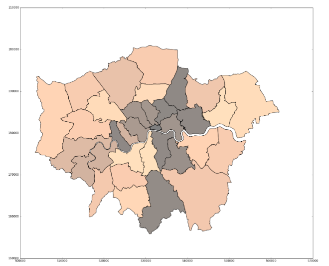
The difficulty of Python is the configuration of the map to fit our needs. Although changing the color scheme is relatively easy, deciding the threshold for a particular color was too difficult for us, especially as the code for using quantiles was devised by someone online, which meant it was necessary to programme according to this code. The reason why it is necessary to change thresholds is to make sure that comparison between maps can be done in the most effective way. It does not make sense to compare a map that is mostly one color and one that is very varied. Quantiles can help solve this problem, but the question remains whether useful comparisons can be made between different factors with different mean values. For example, how can we ensure that a choropleth of fast food outlets, whose average is generally over a thousand, and a choropleth of gym facilities, which are generally less than a thousand, give a good comparison? Quantiles are dividing the color levels according to the values from the data. However, it might be more fitting to set our own levels at which we think is most beneficial to color them.

Carto
When using Carto, the problem we encountered involved correct formatting of the file; uploading CSV files did not work, and we had to upload instead a folder with the ship file in it, deleting the unnecessary files, but keeping the same files in different formats (different extensions). After uploading the file, it was also necessary to manually imput data by adding new columns. The dashboard tools allows easy manipulation of colors.

The advantage with Carto is that the legend, title, and intervals can be manipulated by us. In addition, there is a better user interface as anyone who uses the map may zoom in and drag the map to view what is most interesting, as well as see the actual values for each borough by moving the cursor onto the map. The color scheme for all maps are the same, to enable easier and quicker comparison between them.

Hypothesis testing

All coding was done within a Jupyter iPython Notebook supported by python distribution through Canopy. We also used Microsoft Excel for some data manipulation and for calculations.


Initial steps

The way in which we aimed to test our hypothesis was by checking whether there was a statistical correlation between obesity and our chosen factors. To help guide us, we initially started off by making some provisional graphs such as the one below, which helped give us an idea of whether or not there were links.

graph-1

However, we realised that bar charts such as this are not a suitable method of data representation when specifically considering correlations. As a result, these were not used as final visualisations. Since we hoped to see how different factors (“predictor variables”) impacted obesity (the “response variable”), we decided that scatterplots would be the best type of visualisation (Beh and Lombardo, 2014, p.5).

In order to test our hypothesis, we first extracted the relevant parts from the datasets before we performed any statistical analysis. This was because the raw datasets were mainly large and contained data we were not going to use, and so taking out the parts would result in smaller tables which were clear and easy to work with. We did this using the Pandas package on Python to manipulate the datasets.

First of all, we imported the relevant packages we needed (below). We used pandas to work with the data, matplotlib for plotting graphs and numpy for creating lines of best fit for our scatterplots. We then imported the raw data on obesity as a pandas dataframe, taking only the last 33 rows which corresponded to the 33 London boroughs (below). Many of the datasets we used contained information on other areas in Britain, and, whilst interesting to look at, they were not relevant for testing our hypothesis since we were focussing on London. They were therefore removed from the dataframes within the notebook.

python1

We then imported the data for all our factors: degree attainment, gcse attainment, income, access to green spaces, sports facilities, physical activity and fast food outlets. As can be seen below, we followed the same process for all datasets: recalling only the information on the London boroughs; cleaning the data by removing commas and percentage signs where present; and ensuring the index of the dataframe was always set as the names of the boroughs.

python2.png

Next we merged the obesity dataset with the dataset for our chosen factors, one at a time. As you can see, the reason we made sure that the index was always the names of the boroughs is so that when merging datasets, we could merge on the index (1st line of code, below). Whilst it was possible to merge on specific columns, it was easier to merge on the index since the names of the columns with the area names had slight differences between datasets. Furthermore, we realised that merging would create very large and confusing datasets which had a lot of information we didn’t need, and so we immediately refined the merged data down so we had only the relevent columns (2nd line of code, below).

python3.png

Finally, once we had our merged data with all the relevant information, we used the following line of code, adapted for our specific dataframes, to save our tables to csv, ready for further use: df.to_csv(“df.csv”).


Finding correlations

After the data had been merged and the relevant section compiled into new tables, we then proceeded to calculate correlation coefficients. The correlation coefficient method we decided to use was Spearman’s rank. The reason for this is that during our group discussions, when talking about obesity, we tended to consider the boroughs in terms of ‘the most obese’ or ‘the least obese’ – we were essentially ranking them in our minds. The same can be said for the 7 variables we looked at. Therefore, we felt it was appropriate to calculate the Spearman’s rank correlation coefficient (SRCC); this method would rank the boroughs from 1 to 33 according to both percentage obesity and the other particular factor we were looking at. So, for example, the City of London would have a ranking of 33 in terms of obesity and 1 in terms of mean income. The SRCC is then calculated using the relationship between these rankings using the following equation:
image001
Where d2 is the difference between the ranking for obesity and the ranking for the variable.
r is the correlation coefficient – a number between -1 and 1, where -1 is a perfect negative correlation and 1 is a perfect positive correlation.
The main disadvantage of using SRCC is that it is sensitive to outliers, and therefore where the majority of the data visually shows a weak correlation, an outlier may skew this and the coefficient may indicate a stronger correlation.

At first, we tried to calculate this manually. We ranked the factors on Python. In the example, the merged table with data on obesity and degree attainment has been duplicated (1st line of code, below). To the resulting table, two addition columns were added ranking obesity and degree attainment using the code found here (2nd line of code, below).

python4

We then did all the calculations on Excel as can be seen below:

excel1

However, after calculating one SRCC in this manor, we decided that it wasn’t the most efficient way and was very time consuming. Python was good for ranking but it was difficult to do the maths with, whereas Excel was easier to do calculations on but was slow. We therefore began to look for a simple way to calculate the SRCC on Python and found this. We proceeded to use this code (below) until we had correlation coefficients for all factors (results discussed here and here).

python5


Visualising correlations

Once we had all our SRCCs, we proceeded to make scatterplots, with obesity plotted on the x-axes, and the different variables plotted on the y-axes. The reason for this is because our project was about seeing how these factors impacted obesity, and so obesity was our dependant variable and accordingly belonged on the x-axes.

When we had tried to make scatterplots earlier on in our project using Python, we faced problems because certain datasets would work but most of the time it would result in an error. We found that the solution was to make sure the numerical data in the datasets were set as floats, using: df = df.astype(float).

Having resolved this problem, we made the scatterplots by using: df.plot(kind=scatter). However, we also needed to include a line of best fit to see if the sign and strength of the correlation coefficients we calculated agreed with the scatterplot. We used the code shown below, adapted from here, which uses the np.polyfit() and np.poly1d() commands.

python6

Finally, we labelled the axes, then saved the scatterplots using: plt.savefig(‘df.png’). The final scatterplots can be seen on the entries here.